Care, Inspired by Jane
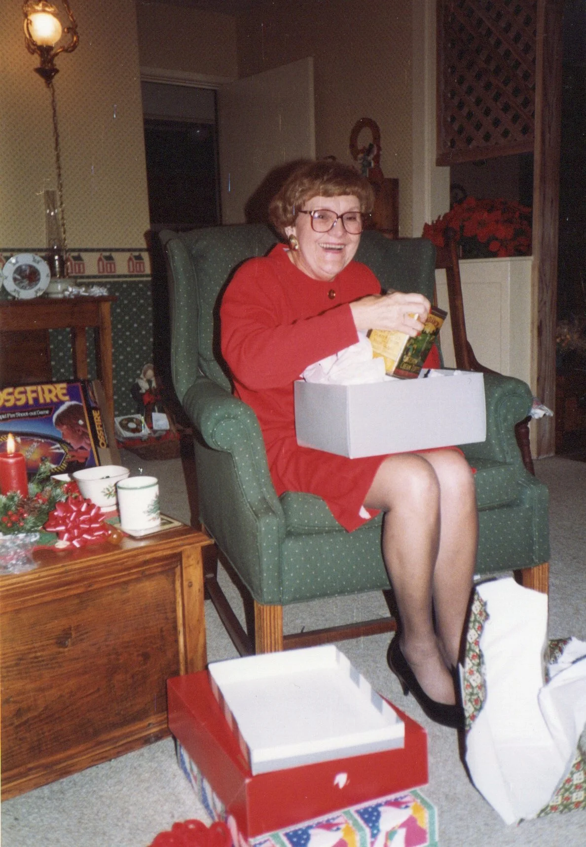
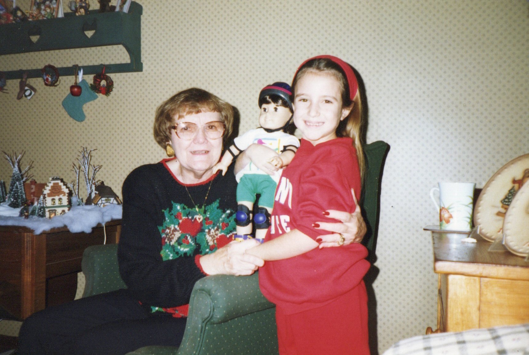
When Jessica Cassidy founded Jane's Home Care, she wasn’t just starting a business — she was honoring a legacy. She named the company after her grandmother, Jane, whose life was marked by quiet, faithful care for others.
Jessica came to me with a simple but weighty goal:
How do we carry Jane’s spirit of selfless service into a brand that families can trust?
Through our discovery process, we unpacked the business model, positioning, and competitive landscape. But the turning point wasn’t strategic — it was personal.
Jessica told me about how Jane would bring communion to elderly people in their homes — meeting them in their most vulnerable moments with dignity, prayer, and presence.
That story became the soul of the brand.

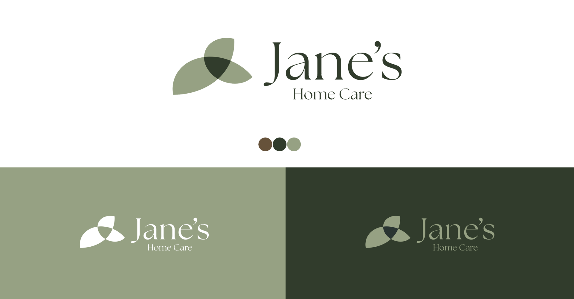
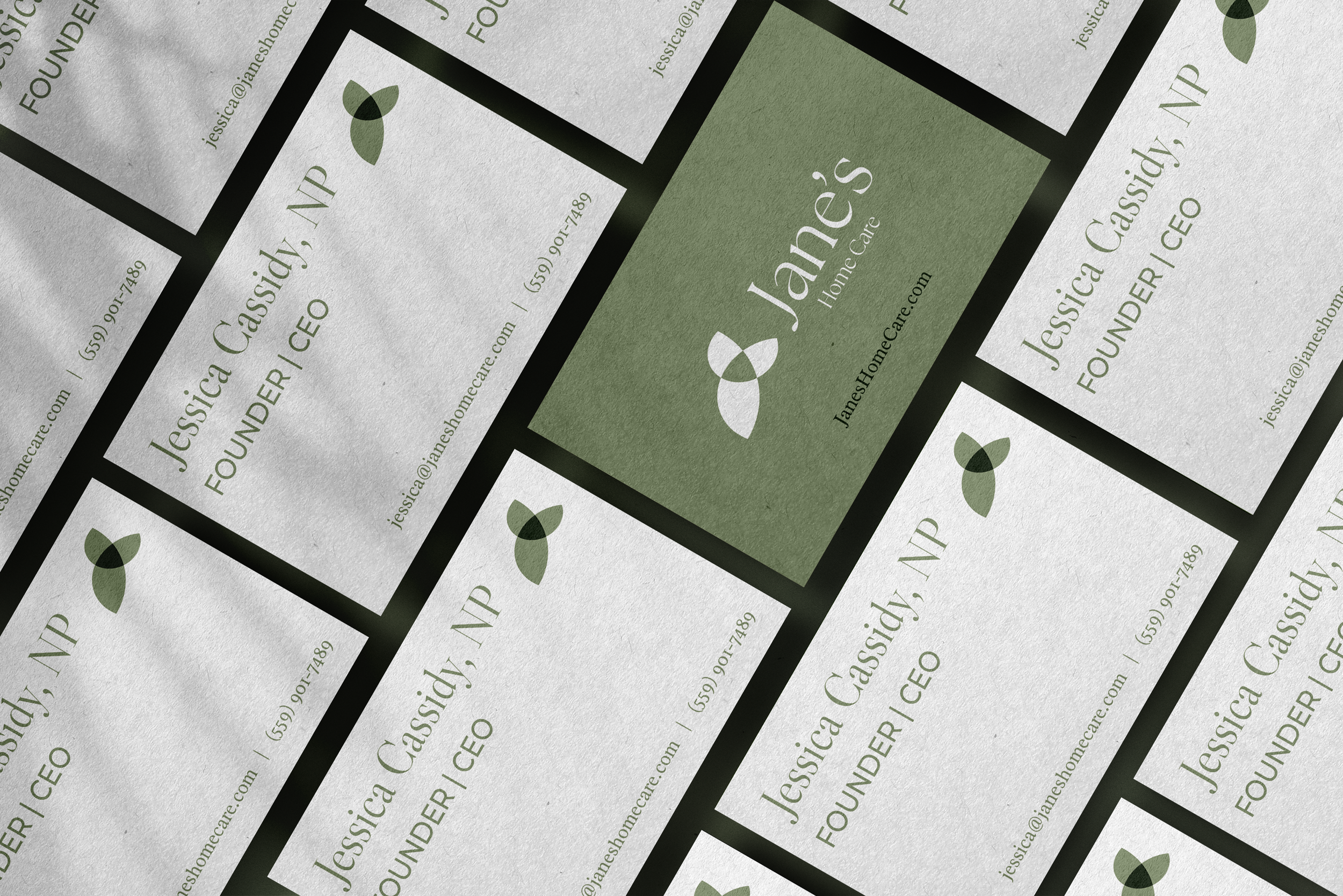
Creative Direction
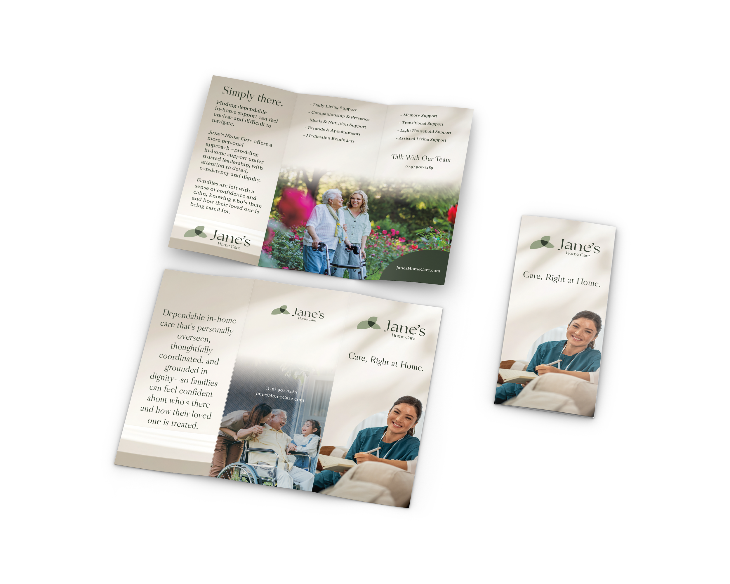
Jane’s Home Care needed to feel calm, warm, and professional — high-touch rather than clinical. The visual tone was designed to reflect boutique-level attentiveness with clinical credibility — understated, reassuring, and deeply human. Inspired by the restorative calm of a day spa — but elevated into something more refined and purposeful.
Concept Logic
The logomark we developed weaves together three meaningful elements:
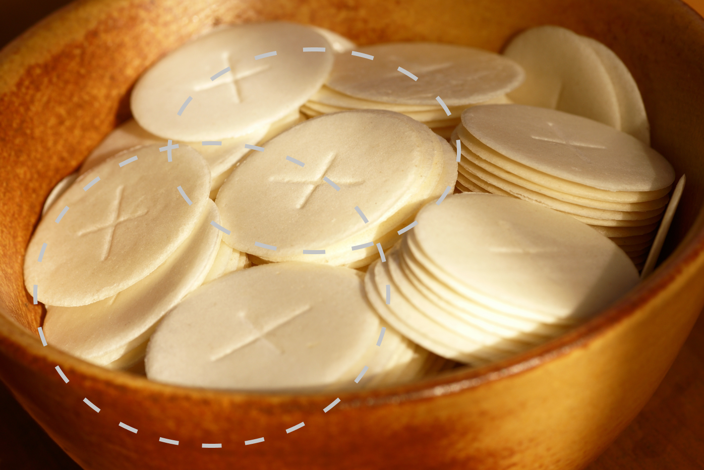

Communion Wafer
A subtle nod to Jane’s legacy of delivering communion—symbolizing grace, service, and sacred care.
Eucalyptus Leaf
A symbol of renewal, calm, and natural wellness.
Triquetra
An ancient symbol of unity and wholeness — representing care for body, mind, and spirit.

These elements were distilled into a single, simple mark — layered with meaning, yet visually quiet. Paired with an elegant semi-serif typeface and a neutral, calming palette, the brand feels refined, trustworthy, and deeply personal.