
Fresno Mission
Brand Strategy | Identity Design | Creative Direction
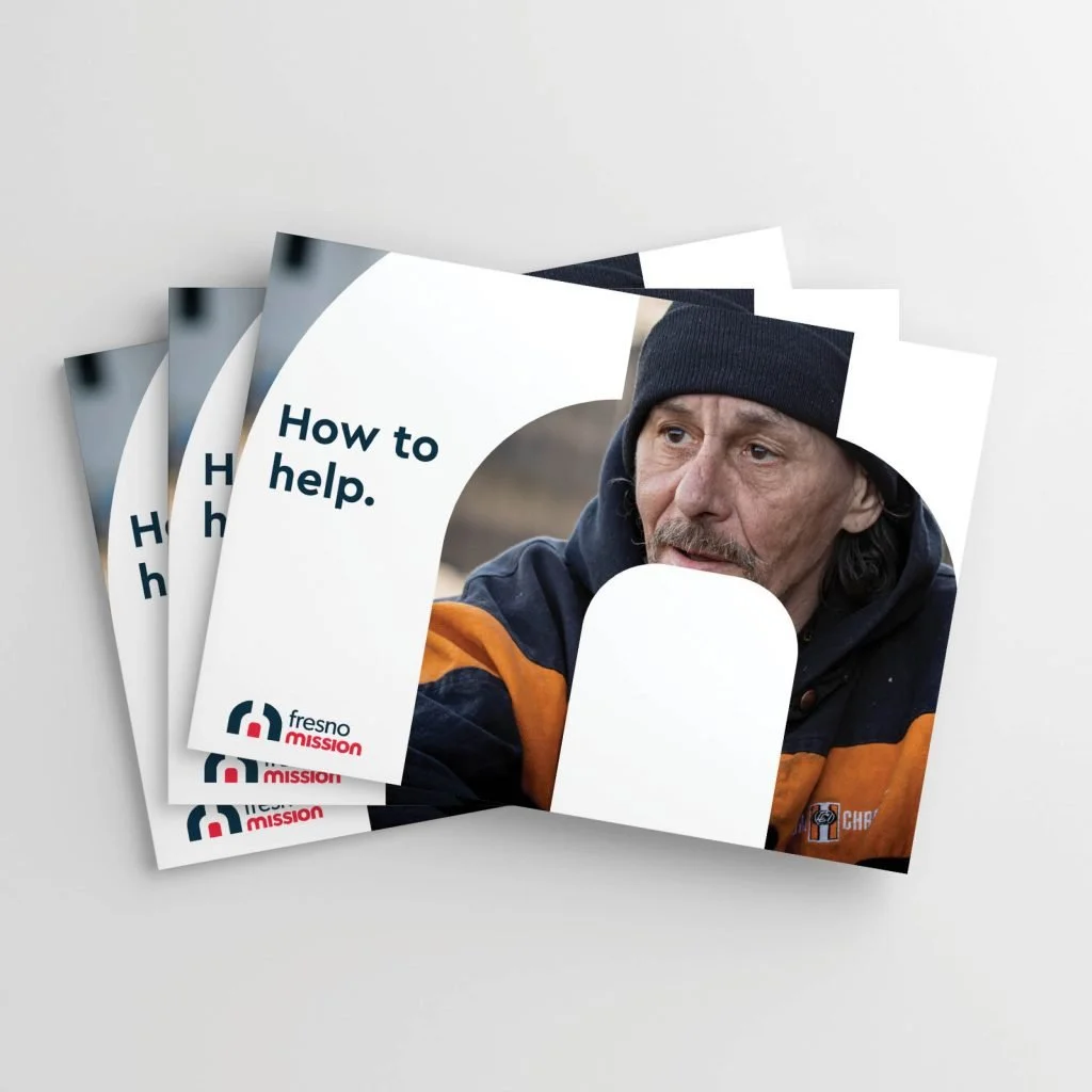
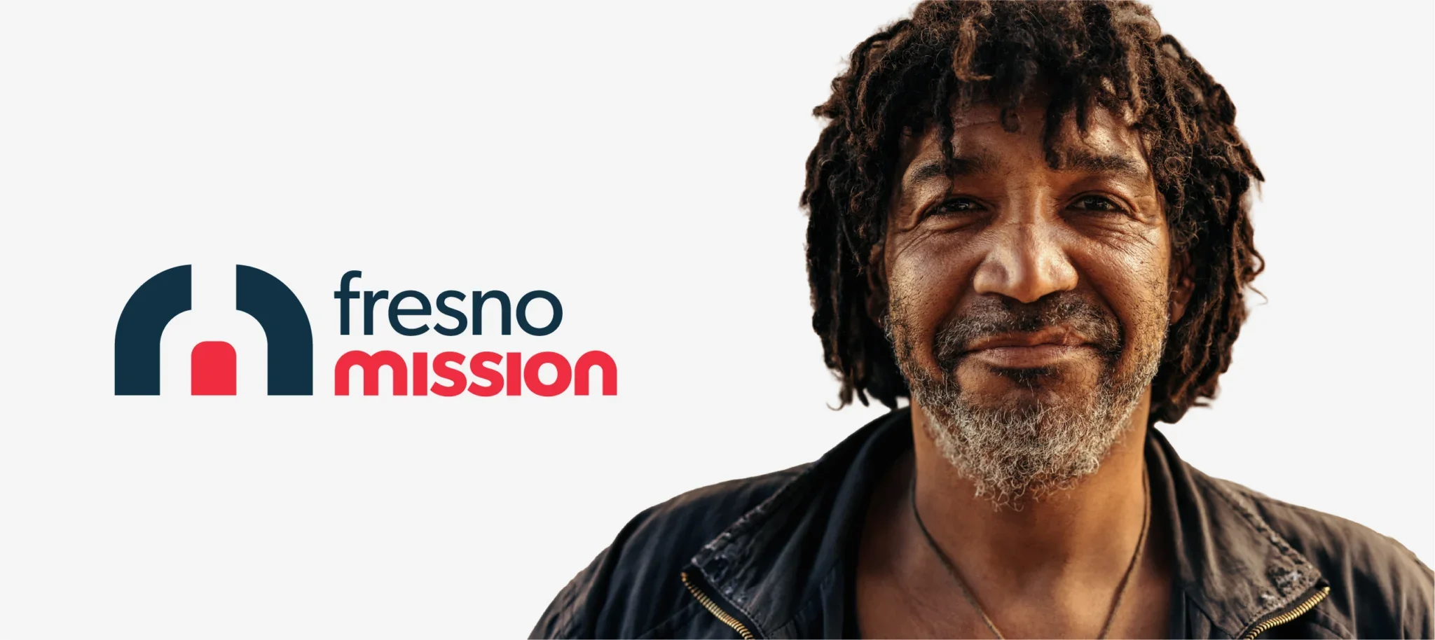
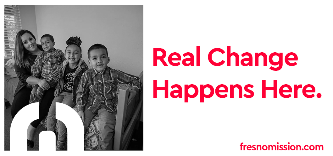
Fresno Mission provides 24-hour Christ-centered support to individuals facing homelessness and crisis in California’s Central Valley.
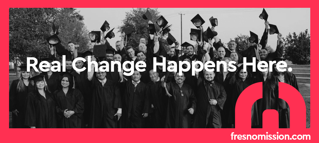
As Creative Director and Brand Strategist, I led the organization through a comprehensive rebrand during a season of expansion. Through collaborative discovery with leadership, we clarified that the Mission’s work had grown beyond emergency rescue into long-term restoration and empowerment.
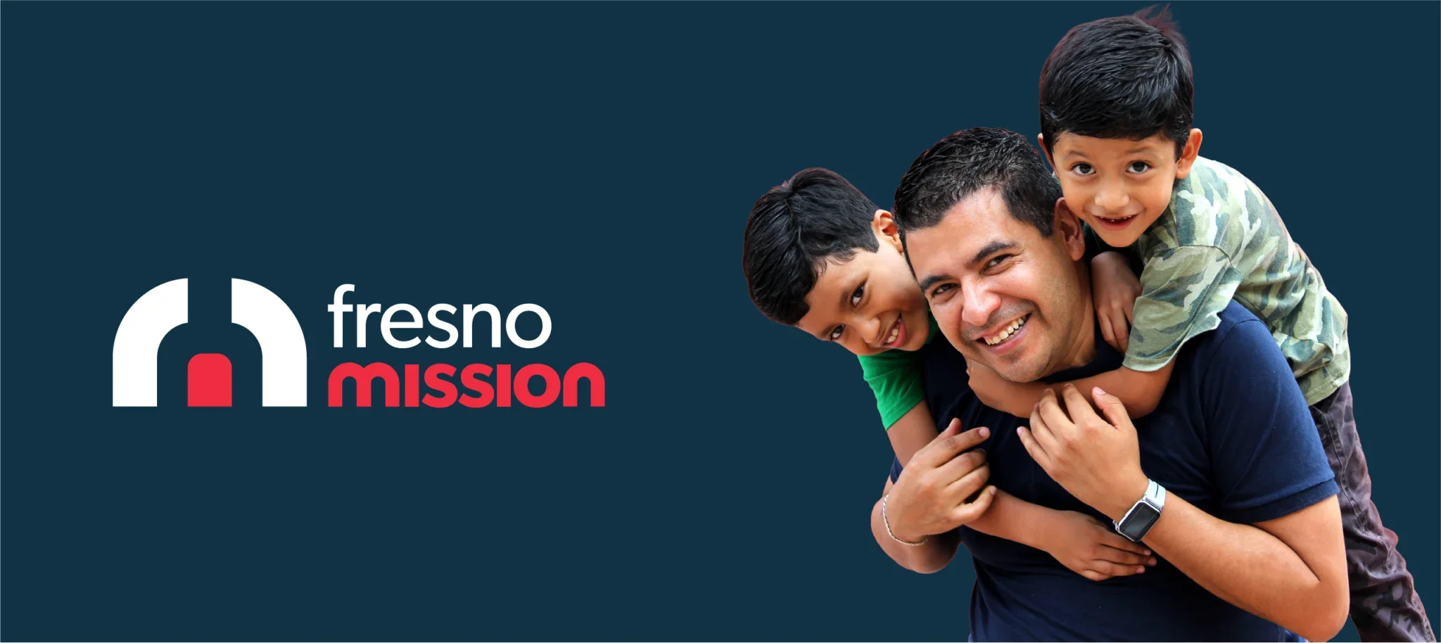
I designed a refreshed identity that honored the original Rescue Mission imagery while modernizing the mark for clarity and longevity. The rainbow arch over the open door symbolizes hope, grace, and light in dark places—reflecting the Mission’s heart and calling.
The result was more than a new logo. It was a unified brand identity aligned with the organization’s evolving impact and long-term vision.

“The redesign process was thorough and well done. It served us far beyond just branding. Sean led us with clarity and collaboration, and remarkably, all 15 of our leadership team members aligned around the final logo—something I don’t think has ever happened in the history of logo making.”